4 Tips to make your company stand out on a Monument Sign
Customers are under heavy attack by different businesses seriously competing for their precious attention, especially at malls where there are a lot of different store signs, and if mall signs or monument signs are being set up, it is quite easy to drown in the sea of signs all over the place. However, getting one’s message across to a lot of customers through signs despite the serious clutter is possible by being creative and having a good knowledge of how to get the much needed attention.
Here are some tips that will help a great deal
Simplicity is key: This fact cannot be over stressed and even Leonardo da Vinci concurred when he said that "simplicity is the ultimate sophistication". It may sound antithetical to some but simplicity is eye catchy because everyone is busy. Getting the attention of the driver who is on his way to work with his eyes on the road or the pedestrian on the street trying to get to some serious engagement requires a sign that is simple because the human mind would naturally avoid signs that are too complex when the eyes dart around. For instance, if one’s pylon sign is not simple, then it is time for a brand new simple design that will still retain their core message to the customer.
Contrast: High contrast images get a lot of attention because they naturally entice the human eyes and are visible from afar. The use of dark colors such as black or dark blue and light colors such as white or off-white is highly recommended for a brand design. A high contrast can so be achieved by using bolder fonts instead of thin lined fonts which would not contrast very well with the background. A bolder font will get the job done easily and thus increase the visibility of the message.
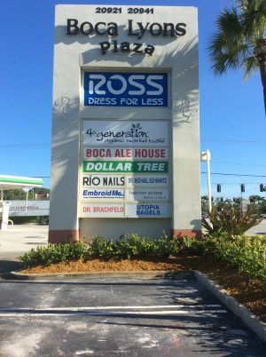
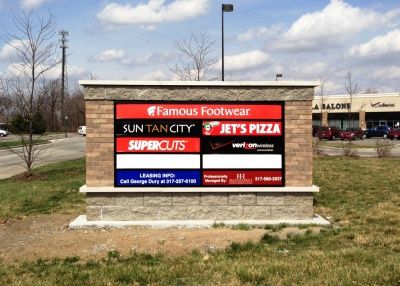
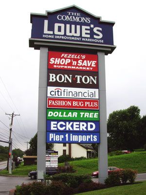
Environment Awareness: It is pertinent to consider where the sign will be located in relation to other signs. The goal here is to stand out and not to blend in. If most of the other signs are similar in terms of color, size, shape or message then it is best to be different in a creative way so that the sign does not become indistinguishable. Therefore, if other signs have a light colored background then a dark colored background may be used and vice versa in order to stand out, gain customer attention and make an impression.
Attention to size and position: The size and position of a sign will go a long way in the quest to make it more effective. Text on paper is read from top to bottom and from the left to the right and also applies to signs on the street. Therefore, it is advised to have signs placed at the top or the left to optimize effectiveness.
Summarily, getting the attention of customers through monument signs, mall signs or pylon signs in an already cluttered place requires creativity and design to make it stand out. That is the ultimate goal and all efforts should be channeled toward that.
Our experts at Sign Partners can assist you with a free consultation. Feel free to contact us at 561.270.6919 or info@sign-partners.com.